好几年之前有在Google I/O 大会相关的视频中看到过material design这个东西,今天又在YouTube中看到了,就重新看了一些,找了一些Google官方的文档尝试去简单了解一下。似乎国内很多很多的厂商的app不那么喜欢MD的设计风格,具体的原因还有待去仔细研究,这里不做优劣评述,仅仅简单了解一下。
Google原生全家桶
一个周末的时间,连续12H+12H的时间,应该等体验一遍下面几十个应用了,挺多的,先把Google play的链接Mark一下先。先不说应用内部,就从这icon就可以看出满满快要溢出屏幕的Google的感觉,就是内味了(material design)。要是体验之后,还可以去油管(YouTube)搜索相关产品视频,看下这些产品设计决策背后的一系列的逻辑,学习他们思考的过程和决策的原因,或许会给自己有一些灵感。这图有点长,但是还是想贴上来感受下内味……
Material Design Basics
关于质感设计,官方是这样介绍的,如下:
Material Design is a visual language that synthesizes the classic principles of good design with the innovation of technology and science.
MD核心的几个Principles
Material is the metaphor
Material Design is inspired by the physical world and its textures, including how they reflect light and cast shadows. Material surfaces reimagine the mediums of paper and ink.
大概的意思就是:艺术源于生活,又要高于生活,但是又不能脱离生活。
有点像我们初高中学的唐诗宋词,是不是有一个类似拟物或者拟人的概念?姑且就叫它拟物吧
Bold, graphic, intentional
Material Design is guided by print design methods — typography, grids, space, scale, color, and imagery — to create hierarchy, meaning, and focus that immerse viewers in the experience.
大概的意思就是:字体、版式,网格,空间,比例,颜色和图像等不仅仅是直观的界面展示,还要是简单且有意义的表达清楚所传达的信息架构、内容意义,最关键的是能帮助用户聚焦,说人话就是很容易自在的沉浸其中。太难了啊哈哈哈哈哈
Motion provides meaning
Motion focuses attention and maintains continuity, through subtle feedback and coherent transitions. As elements appear on screen, they transform and reorganize the environment, with interactions generating new transformations.
大概的意思就是:有意义的动效,一定是有意义有逻辑的。通过动效微妙的反馈和连贯的过渡来吸引注意力并保持连续性。当元素出现在屏幕上时,它们将转换并重新组织环境,而交互会产生新的转换。说人话就是追求自然流畅的交互动效,完整极致的用户体验。这也很难啊哈哈哈哈,精髓。我在官方的油管视频中看到那些弧形动效的逻辑,确实是有这么点逻辑和感觉。
关于动画效果这块,官方还有四个小玩意要说明的。
Authentic Motion
动效的价值容易理解。不是要酷酷炫炫的,是要看到物体的移动就容易懂得怎么去使用它,并能了解它的各种形态,能给用户体验带来真实价值。Responsive Interaction
动效是有逻辑的,用户会开心。动效不应该是随机发生、没有意义的。Meaningful Transitions
有意义的动效,带领用户的注意力去理解流程。比如滑块,滑块有弹性但是不能滑走,用户就明白这个状态下是不能滑动的。如果没有弹性,用户可能以为死机了或者卡了,这样体验就不是很好。Delightful Details
动效细节可以让用户惊喜。小细节也有小惊喜。
Flexible foundation
The Material Design system is designed to enable brand expression. It’s integrated with a custom code base that allows the seamless implementation of components, plug-ins, and design elements.
大概的意思就是说,要有挺强的延续性和可扩展性。MD设计系统旨在实现品牌表达,它与自定义代码库集成在一起,可以无缝实现组件,插件和设计元素。所以就有很多可以资源库和插件库,有很多开发者、设计师支持,形成一个派系这种感觉。比如Flutter是谷歌的移动UI框架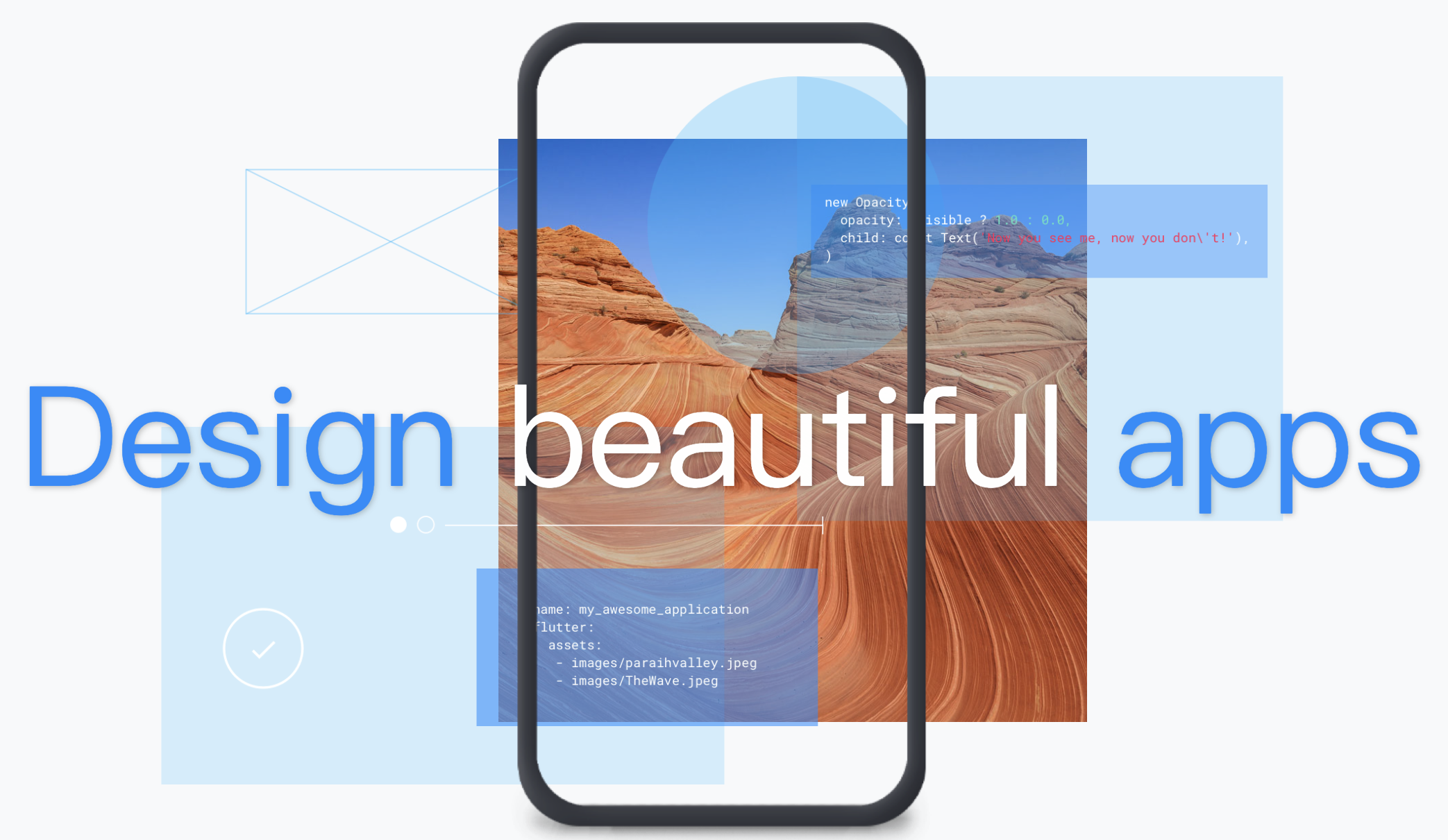
Cross-platform
Material Design maintains the same UI across platforms, using shared components across Android, iOS, Flutter, and the web.
大概的意思就是说:跨平台性,一次开发,多平台适配。这样能降低设计成本,降低开发成本,在跨平台上也能提供统一的原滋原味的流畅体验。这确实是一个大的方向,形成一个生态,现在这么多设备,手机、pc、pad、手表、汽车、家庭娱乐等等,万物互联的时代体验也要万物互联。说到这个,越来越多的厂商开始做跨设备了,Apple、Microsoft、Google、华为、小米等,都在建立自己的生态。所以跨平台是必要考虑因素。
Goals
关于goals,官方如是说:
Create
Create a visual language that synthesizes the classic principles of good design with the innovation and possibility of technology and science.
将优秀设计的经典原理与技术科学的创新尽可能性相结合,创建一种新的视觉语言。Unify
Develop a single underlying system that unifies the user experience across platforms, devices, and input methods.
以统一跨平台,设备和输入理念的用户体验,开发一个基础系统。Customize
Expand Material’s visual language and provide a flexible foundation for innovation and brand expression.
扩展Material的视觉语言,并为创新和品牌表达提供灵活的基础。
- 借大学老师卫博士的一句话总结:
要做对人类有长远意义的事,这才叫使命。
End
粗浅了解一下,这些文档和视频后面等花不少时间和精力去慢慢研究,先存下来先。
官方的链接,官方的就是精髓,万变不离其中,存档。
1.Android开发者官网-设计和质量
2.Google Material Design Guidance and Code
3.Google Design - YouTube视频合集
后面估计还会去看看Apple与Microsoft等的规范,看看有何不可不同之处。